20MAR 2012
 © asli aydin The “Bridge-City” scheme included a series of inhabited bridges over the Flon Valley. While the redevelopment of the valley lapsed without funding, local transit authorities approached Bernard Tschumi and M + V for the design of a new transit station, the first phase of which was completed in 2001--a light rail station characterized by red printed glass, a new pedestrian bridge, and connections to the valley at the Place de l’Europe.
 © asli aydin
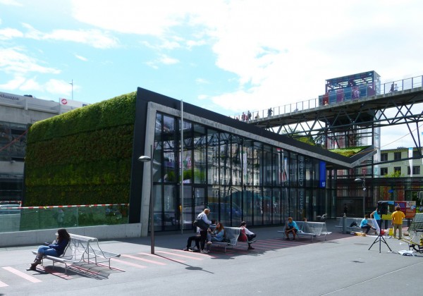
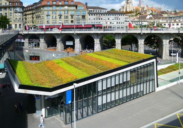
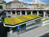
The second phase was to incorporate a ticket counter, escalators, and a subway station as part of the transit hub complex. The new building, which features a dramatic concrete fold covered with a green roof, and a long pedestrian ramp, addresses these programs while expanding the first phase to the west, creating further transit connections at the heart of the city.
 © asli aydin
As the main ticket office for TL, the building needed to convey a public image for the transit authority and the city at large. The main gesture of the project is the folded concrete, which acts as though a strip of the plaza has been folded and bent back on itself to accommodate a ticket office to the east, and a pedestrian ramp to the subterranean level on the west. The rupture and folds are reminiscent of the topography of Lausanne and the geological history of the Alps.
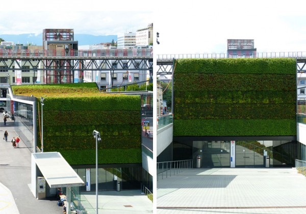 © asli aydin The roof and west wall are covered in a green carpet of plantings, which addresses environmental concerns of the client, but also links the second phase with the first phase, which incorporates a landscaped berm into a sunken oval, opening the subterranean light rail to natural daylight. The building also houses some offices for the transportation authority that have both privacy and natural light.
 ©
The program was resolved using the strategy of the fold: the main structural gesture is in concrete, as though a piece of the plaza has been cut away and raised back on itself with the sides of the “slice” faced in glass. The building is treated with sturdy industrial materials and details, suited to the heavy traffic of a major transit center.
 © .
© .
 © asli aydin
 © asli aydin
 © asli aydin
 © asli aydin
 ©
©
 ©
©
M2 Metro Station / Tschumi
Posted in Architecture - Infrastructure by Kseniya SHkroban | Tags: Swiss, Green
The M2 Transit Hub has had a long incubation period, marked by three distinct phases. In the early 1990s, Bernard Tschumi submitted a competition for the redevelopment of the Flon Valley. © asli aydin
 © asli aydin
 © asli aydin
 © asli aydin
 ©
©  ©
©  © asli aydin
 © asli aydin
 © asli aydin
 © asli aydin
 ©
©
 ©
©
Comments
No comments
Sign in »


