19FEB 2015
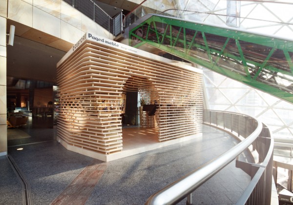
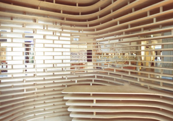
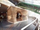
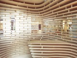
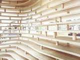
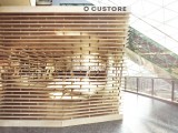
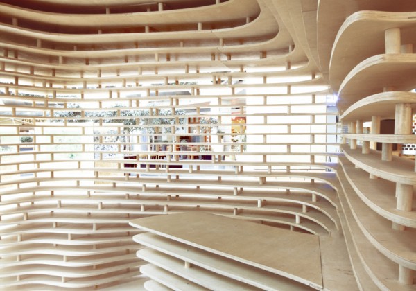 © Paulina Sasinowska (smileupyourself), Anna Dobek, Mateusz WojcickiA. Plywood, valued for its aesthetic and endurance properties, was used as the main and only substance (with the exception of confirmat mounting screws and beech wood expandable anchor sleeves) for the construction of the Custore pavilion.The originators of Custore concept store (“customize” + “store”) wanted to create a space which would be the combination of a store and an art gallery. An innovative way of presenting the range of products on touch screens, encouraging creativity and giving customers the opportunity to contribute to making their own furniture, needed an extraordinary package.The key guideline from the client – the Circus Digitalis group – was the assumption that the pavilion should provide a partial visual isolation while still being open to the surrounding space. By following this guideline we created a theme for the pavilion – a translucent barrier between a strongly geometrically defined exterior and a soft interior.
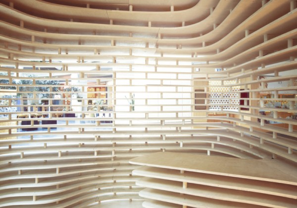 © Paulina Sasinowska (smileupyourself), Anna Dobek, Mateusz Wojcicki The material used in this project also gave the impression of cosiness, which was highlighted by the small area of the pavilion.Inside the pavilion we located an information point and four stands with touchscreen monitors. The structure fits in with the interior of “Złote tarasy” shopping centre which is sheltered by triangular panes of glass embedded in a steel structure – the first example of the use of parametric architecture in Poland.Technology
The design process required such an arrangement of work to make modifications possibleat any stage. The choice of the parametric method was crucial because of the changing guidelines, which were conditioned by the technological, dimensional, logistic and functional issues. We have divided the form of the pavilion into two parts – soft and sculptural interior and straight geometrical exterior. This enabled a much more flexible shaping of the final form of the pavilion, depending on the changing guidelines.
 © Paulina Sasinowska (smileupyourself), Anna Dobek, Mateusz WojcickiThe initial parameters of the pavilion included its size, type of material to be used and the density of its application. The only hand-drawn elements of the pavilion were 8 sections of the shell defining the interior, which after processing enabled the modelling of the final curve that gave the definite shape of the interior. These sections were dynamically linked to the structure of the pavilion and their modification has its representation in real time in the form of the changing shape of the interior.The use of algorithms to shape the pavilion led to continuous experimenting with the properties of pavilion joints, the design and calculation of costs and material consumption. The division into modules that defined the pavilion interior and exterior also gave the opportunity to experiment with the look of the whole body, regardless of the shape of its interior.To define an algorithm which generated the pavilion we used the Grasshopper and Rhinoceros software. Preparation of the files for digital fabrication required cleaning and improving the issues that were not possible to be solved with the applied algorithm.
 © Paulina Sasinowska (smileupyourself), Anna Dobek, Mateusz Wojcicki In AutoCAD, we added the missing drill holes to connect the thimbles, providing vertical joining of the structure, and we cut profiles, adjusting cutting mats to the size of plywood sheets manufactured by PAGED Sklejka. The profiles were then converted into a format readable by a CNC machine, which milled the parts ready for assembly.Assembly
One of the key objectives of the project was the possibility of re-assembling and transporting it by a van. Therefore, the pavilion after the initial prototype installation (with individual components such as sleeves and sections cut by the machine) had to be dismantled back to basic modules that could then be re-assembled again – with target modules. During this process it was possible to test the structural stability and make potential corrections. This process also had a big impact on the final form of the pavilion.
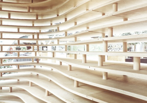 © Paulina Sasinowska (smileupyourself), Anna Dobek, Mateusz WojcickiCommercial structures differ from the pure-experimental and academic ones due to the need to adapt the structures to be used in a variety of sensitive environments. Another important factor influencing the shape and form of the pavilion were the guidelines issued by the fire department, which forced the opening of the roof structure and the installation of a construction element (beam) to ensure the proper transfer of forces to prevent the collapsing of the structure towards its center.Custore Pavilion was an interesting project, in which the still trailblazing computer-generated forms are correlated with real commercial market guidelines. The structure is designed to test such solutions in terms of the role they can play in the process of advertising and showing the product to an ordinary consumer. Curiously enough, on the Polish market this type of architecture on one hand sparks the audience’s curiosity, but on the other hand it is also perceived with a kind of distance, which fades over time as the user gets used to the object of interaction.A very important aspect in this case were the younger customers. During the first contact with the pavilion they did not feel any distance, which resulted in a much more interesting form of interaction.
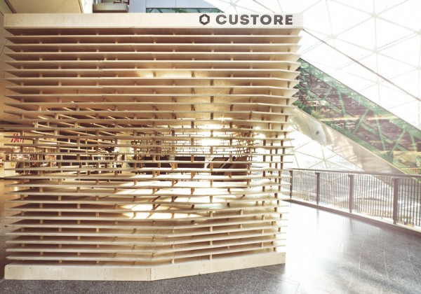 © Such an interaction is critical to at least initiate a similar yet more restrained “communication” between the adults accompanying the younger audience and the modern structure of the pavilion.All in all, the effect of sparking the customers’ interest in the very form of the pavilion has been achieved, and further guidance and direction of implications of such forms in commercial markets will be defined after examining the customers’ response to the exploitation of the pavilion in the long run..
 © Paulina Sasinowska (smileupyourself), Anna Dobek, Mateusz Wojcicki
 © Paulina Sasinowska (smileupyourself), Anna Dobek, Mateusz Wojcicki
 © Paulina Sasinowska (smileupyourself), Anna Dobek, Mateusz Wojcicki
 © Paulina Sasinowska (smileupyourself), Anna Dobek, Mateusz Wojcicki
 © Paulina Sasinowska (smileupyourself), Anna Dobek, Mateusz Wojcicki
 ©
©
Custore Pavilion / Anna Dobek + Mateusz Wojcicki
Posted in Architecture - Pavilion by * FORMAKERS
Custore, an experimental project, is a pavilion that explores the areas of parametric architecture used for the commercial market. Designed by Anna Dobek + Mateusz Wojcicki, they had to deal not only with the aesthetic issues of computer-generated sculptural forms, but also with practical problems associated with the execution of the project inside a commercial building, and – most importantly – with the real clash of artistic forms and commercial market guidelines. More images and architects’ description after the break.The design process began with the choice of material driven by the cooperation with the largest plywood producer in Poland – PAGED Sklejka S. © Paulina Sasinowska (smileupyourself), Anna Dobek, Mateusz Wojcicki
 © Paulina Sasinowska (smileupyourself), Anna Dobek, Mateusz Wojcicki
 © Paulina Sasinowska (smileupyourself), Anna Dobek, Mateusz Wojcicki
 © Paulina Sasinowska (smileupyourself), Anna Dobek, Mateusz Wojcicki
 © Paulina Sasinowska (smileupyourself), Anna Dobek, Mateusz Wojcicki
 ©
©  © Paulina Sasinowska (smileupyourself), Anna Dobek, Mateusz Wojcicki
 © Paulina Sasinowska (smileupyourself), Anna Dobek, Mateusz Wojcicki
 © Paulina Sasinowska (smileupyourself), Anna Dobek, Mateusz Wojcicki
 © Paulina Sasinowska (smileupyourself), Anna Dobek, Mateusz Wojcicki
 © Paulina Sasinowska (smileupyourself), Anna Dobek, Mateusz Wojcicki
 ©
©
Comments
No comments
Sign in »


